
Introduction
Mobile first is a design philosophy that has been around for years. It was originally coined by Luke Wroblewski in 2010 and it’s seen some popularity recently as people are starting to realise the importance of mobile. Mobile first doesn’t just mean designing your website so it looks good on a phone, but also thinking about what information should be available on a mobile device and how best to present it. This article will explore the basics of this design philosophy, including why you might want to use it for your own site or business and some tips on implementing it successfully.
What is Mobile First Design
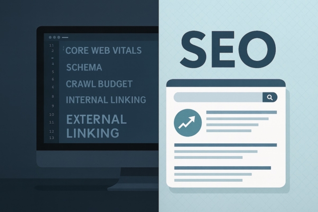
Mobile first design is a website design technique for when users are more likely to use mobile devices to browse the internet. This technique ensures that sites are designed first with a mobile-friendly layout. The idea behind this is that people will be able to navigate your site on their small screens without having to zoom in and out or scroll left and right. The viewers will have an easier experience navigating your site and may also be more likely to spend more time there because of the convenience. Mobile first web design can also help boost search engine optimisation (SEO) rankings. Because many search engines rank websites higher if they provide both desktop and mobile friendly versions, following the mobile first approach will give you a double benefit: better SEO rankings due to providing two versions , and better user experience due to a mobile friendly layout.
Many people have been doing this for years. In the past, when most people were viewing websites through desktop computers, many online stores had two versions of their site: one for when the visitor was browsing from a desktop computer and one for when they were browsing from a mobile device. This is still considered mobile first design, but with just a single code base. More recently, Google introduced something called Accelerated Mobile Pages (AMP). Basically, this means that you are able to create your content so that it loads fast on all devices down to the second level domain instead of having separate URLs for the same content. Could the AMP format be what finally puts an end to mobile-friendly websites?
Attentive readers may have noticed that I didn’t mention responsive design in this article. According to Wikipedia , responsive design refers to ‘designing web pages to provide an optimal viewing experience-easy reading and navigation with a minimum of resizing, panning, and scrolling-across a wide range of devices (from desktop computer monitors to mobile phones)’ [1]. So responsive design is basically what we were doing in the past when creating two versions for our websites: one version that was meant for desktop computer users and one for people browsing from their phones. Mobile first design takes this even further by designing the site first based on what it would look like on small screens, then using responsive design to create smaller versions which will fit larger ones as well.
Why to use it
Mobile first design will help improve your website’s user experience. By creating a site layout that is optimised for mobile devices, you are catering to your visitors so they can better navigate and read your site on their small screens. Mobile first design also has many benefits when it comes to SEO. Search engines give websites higher rankings when they provide multiple versions of the same content, and with the use of responsive design, you can create smaller versions of your content that will fit all screen sizes without having to resort to separate site domains. Finally, this strategy is also good for businesses because it means less work for them.
It is much easier to build one site instead of a separate mobile version and a separate desktop version.
What not to do
Just because you implement this design does not mean that you have the freedom to ignore other design considerations. As with other forms of website design, there are things that you should not do with your mobile first websites: Do not provide less content for mobile users – it’s bad practice to limit what people can access based on the device we are using. You want people viewing your content via whatever device they prefer; if someone wants it in black and white text on their phone, then so be it! Just ensure the information they require is still there when required. Do not make assumptions about screen size – keep everything flexible as you are designing your site. If you want to have certain elements stick together on a page, make sure they will still look good when stacked vertically rather than horizontally. By keeping things flexible, you can be sure that everything will still work no matter what device is used to view it.
No matter which options you choose for your mobile first design strategy, there is one thing that all forms of design share in common: the importance of testing! Investing time and resources into running tests on both devices and browsers is vital if we want to provide our users with an optimal experience as often as possible. And how do we determine whether something works or not? Metrics! Proper analytics will help us track what content is most popular and where people go once they hit our sites, so we can ensure that the most important content is displayed where it should be. Do not let your mobile users down – we are counting on you to provide a good user experience!
Examples of mobile first design in action
One of the first websites to be mobile first was Nike.com.
More and more websites are beginning to make the switch to ‘mobile first’.
The Huffington Post actually wrote an article about how they’re ditching their desktop site and going exclusively mobile. Sites who have made the change say that it’s not hard to do at all, as long as you don’t put too many resources on your site at one time. It’s important that you take a step back and look at what your users would need from your website before making any design changes or starting work on your site.
Key considerations when implementing this type of design strategy
The first thing to consider is the company’s resources. This includes the time, money and manpower available to make changes. It also includes what your budget for marketing your site will be. Those are all factors that you’ll need to consider when going mobile first and picking a design strategy. The other critical thing to consider, especially if you’re a business, is your target audience. You need to get inside the heads of those people and see things from their perspective. Who are they? What’s their age range? What are they trying to accomplish when using your site? How will that look on mobile versus desktop? The answers to these questions will lead you down the path of designing the most effective solution for your users.
If you don’t know who your target audience is or what they want, you may not be able to create an effective design strategy at all. Being aware of the latest technologies is one thing; using them in such a way that has an effect on user experience (UX) is another. You’ll need to determine the features you’ll add or remove for mobile. You might need to simplify things, like removing some pictures or links or even sections of your site. The absolute first thing to do is take a look at what kind of software platforms you’ll be using and how users will interact with them on mobile devices vs desktops.
– Does it have any bugs that hamper performance?
– Does it load quickly enough in a browser?
– Is there an easy way to save pages, images or videos from the site?
Tips for success with mobile first design
The first thing you will need to do when designing for mobile is make sure your site has a good UX. What this means is that the site must be easy to use, have good graphics and colours, and have an app-like feel. In order to create this type of design, you’ll want create buttons and links that are large enough to easily tap on a mobile device. The next thing you’ll want to think about is the layout of your site. If it’s too cluttered or complicated then it might not work well on a small screen. Consider whether or not you should divide content into tabs, or keep everything together in one column. You also want to decide which features are best for mobile visitors: some features might not work well on mobile devices, like logins or multimedia content.
If you have mobile apps or a responsive site, then you should stay away from using Flash. While it was a useful tool back in the day, now it’s counterproductive because users avoid sites that use it for security reasons. You’ll also want to make sure your website is fast on all platforms; otherwise, people will get frustrated and leave before looking at your content.
If your website takes too long to load, people will leave before getting to the content they’re looking for; so be mindful of page size when making design changes. You’ll want everything to load quickly in order for people to have an enjoyable experience browsing from their phones or tablets.
Conclusion
Mobile first is a term you may have seen floating around the tech scene, but do you know what it entails? In a nutshell, this means building your websites for viewing on small screens like phones and tablets first. The vast majority of internet users are accessing the web via their mobile devices these days, so why not make your website optimised for that in order to give them the best possible experience? While there’s no one-size-fits-all approach to mobile design or development, we hope our tips will inspire some new ideas about how you can create an effective strategy tailored towards user behavior. We’re always here if you need help with UX or marketing planning; just let us know!