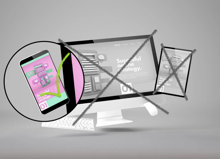
Mobile devices are steadily becoming the most popular devices used to access the internet. If your website isn’t mobile-friendly, you’re missing out on a lot of potential business. In this article, we will explain why you need a mobile-friendly website and how to make your website mobile-friendly.
The first reason you need a mobile-friendly website is because more and more people are using their mobile devices to access the internet. A recent study found that 61% of internet users access the internet from their mobile devices. That’s a lot of potential customers that you’re missing out on if your website isn’t mobile-friendly.
The second reason you need a mobile-friendly website is because Google is now penalising websites that aren’t mobile-friendly. Google announced that as of April 2021, if your website isn’t mobile-friendly it will be harder to rank well in the search engine rankings. This means less people visiting your site and less potential business for you.
What this all comes down to is that if your website isn’t mobile-friendly, then you’re losing a lot of potential traffic which also means a loss of potential customers and business. The easiest way to avoid this problem is by making sure your website is mobile-friendly so more people can access your site from their smartphones or tablets.
Mobile websites vs responsive websites Which should I choose? If you have a WordPress website, we recommend choosing the “Responsive” option over “Mobile”. This is because with a “Mobile” website, you have to create and host a separate mobile website which means additional setup fees and hosting costs. By choosing the “Responsive” option, your WordPress site will be optimised for all devices including smartphones and tablets so there’s no need to create an additional mobile website.
If you’re tired of losing out on potential customers and business simply because your website is not mobile-friendly then contact us today about updating your current WordPress website to make sure it’s compatible with all devices or we can also give you a quote on building a brand new mobile-friendly WordPress website that will give you more traffic and conversions from visitors using their smartphones or tablets.